Brunswick Renovation
My client Samantha Everton https://samanthaeverton.com/ creates amazing photographic artwork. Her work is colourful, surrealist, dramatic but full of fun elements. So when she approached me to help her design her home in Brunswick, I had a feeling we were going to have fun working together.
Much like her artwork, Samantha had big visions for her home to be full of colour, pattern and surprises.
We added lots of quirky elements throughout including animals aplenty!
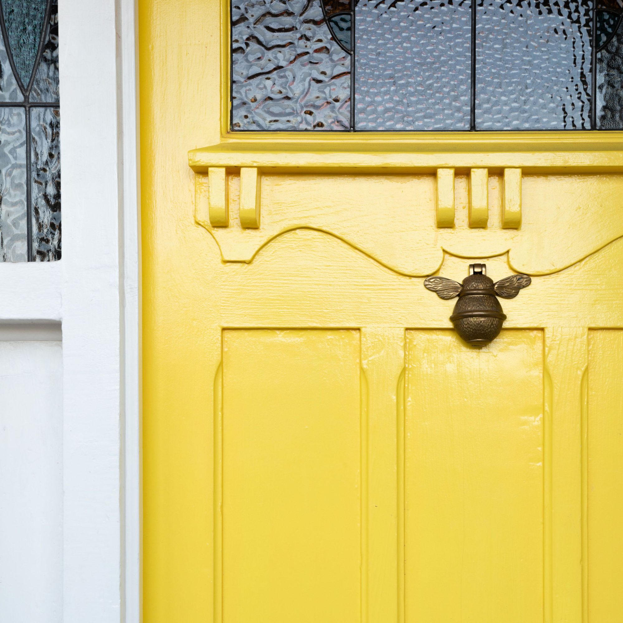
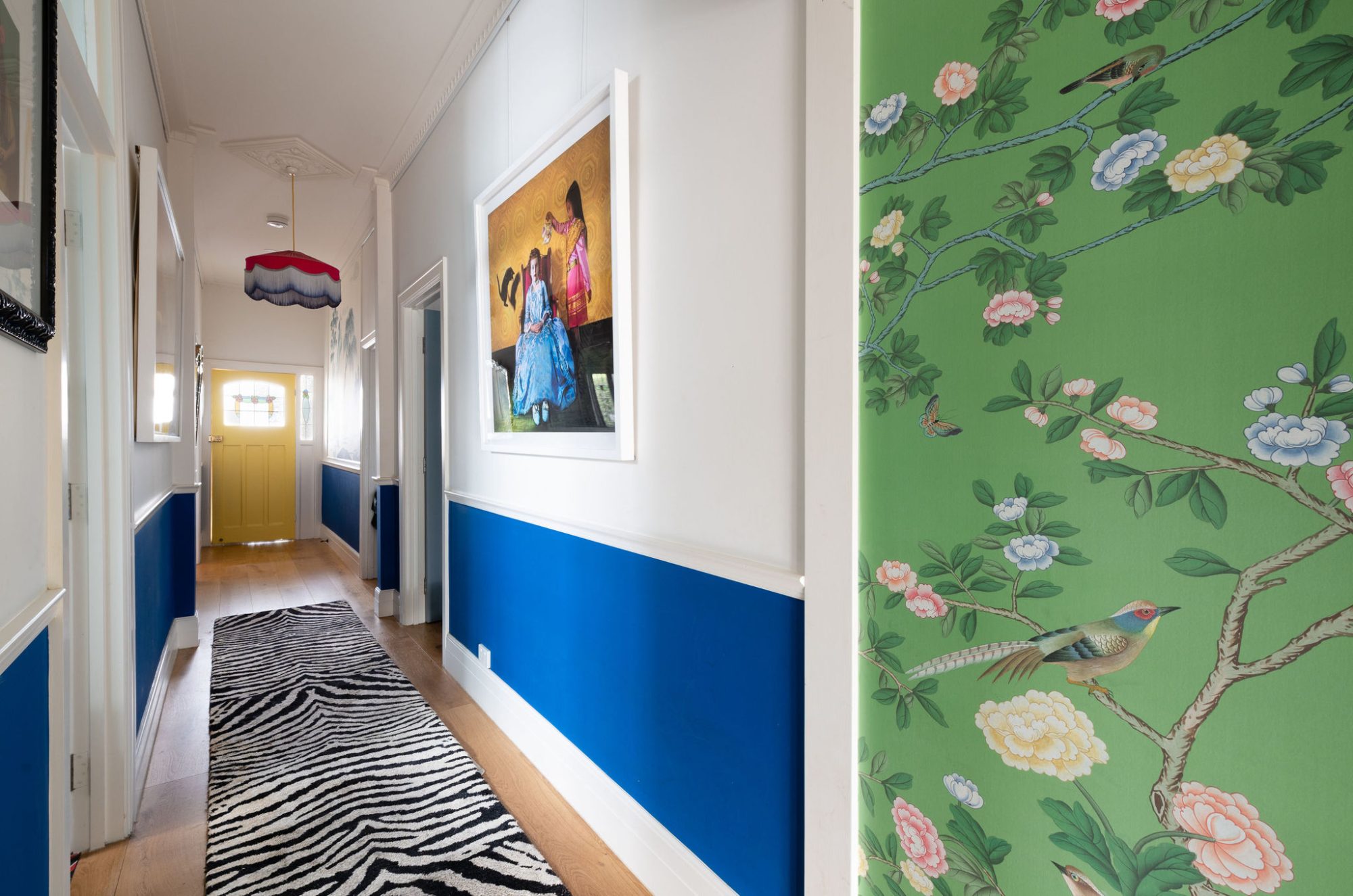
Starting at the front door, we knew we wanted a bold colour and landed on yellow. The bee knocker is the first sign of what is to come.
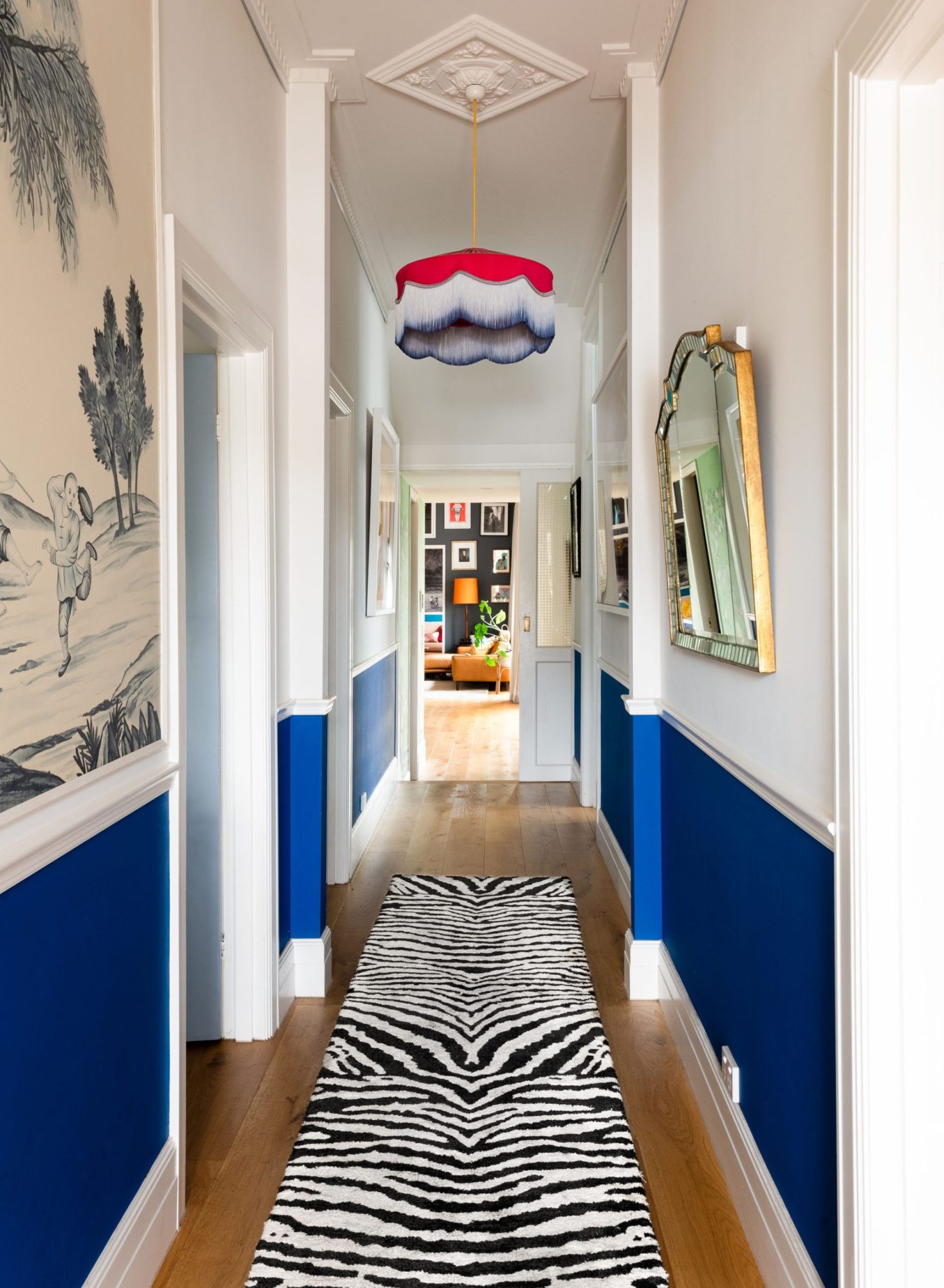
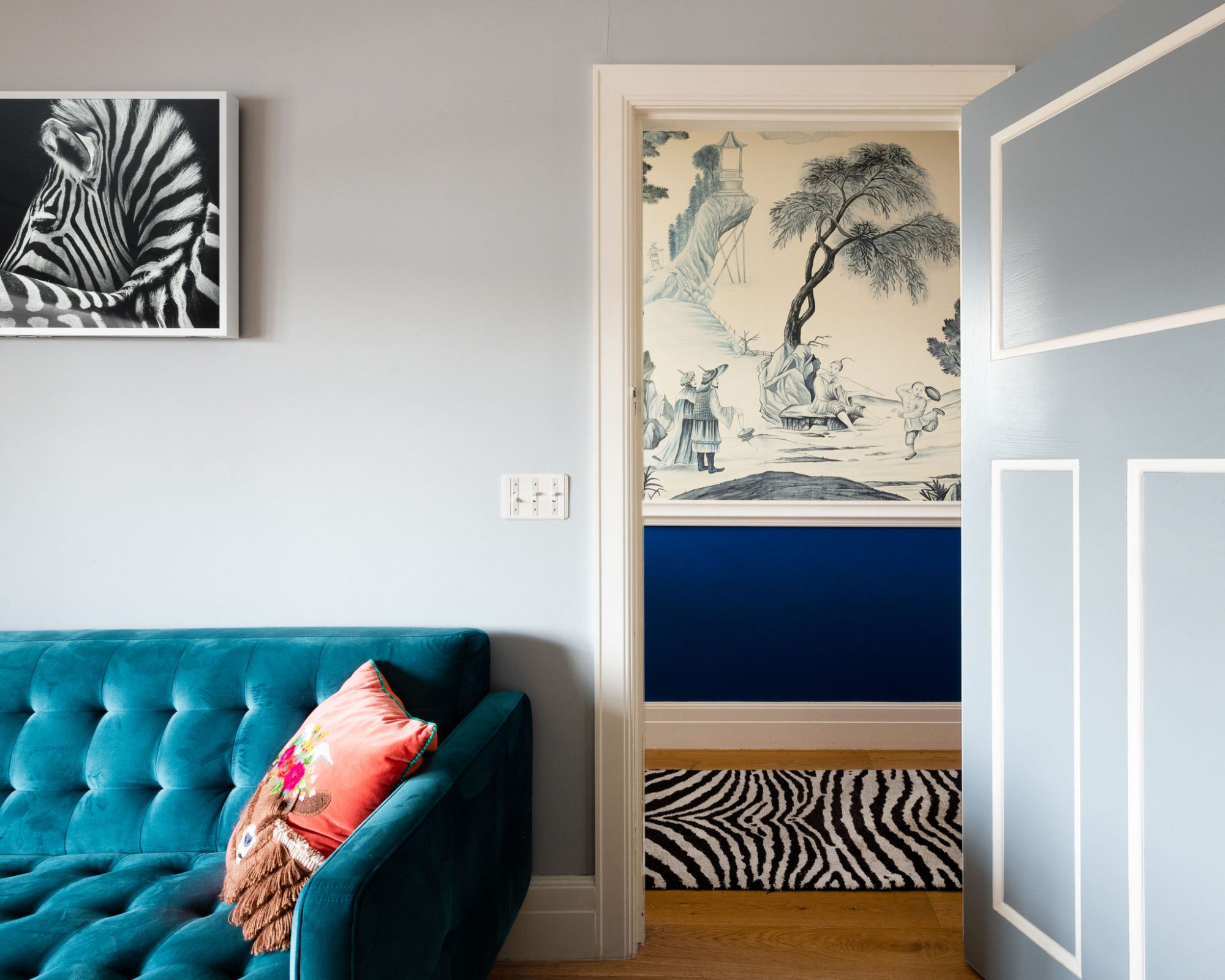
In the entry hallway we added the dado rail and painted each door facing the hall in grey details. Samantha had two hand painted wallpapers that she used as backdrops in her artwork. Throughout the project, we knew we wanted to utilise them somewhere but couldn’t land on exactly where. It was towards the end of the project that we decided upon putting them in the hallway. The first blue and white chinoiserie design was placed opposite the master bedroom. The green and pink floral design was outside the green and pink mud room. Both papers are beautiful, but you can’t quite take the designs in until you’re in the rooms facing them. Only then does the beauty of them come to light. One of the features of the hallway is the handmade pendant with the dip dyed fringe.
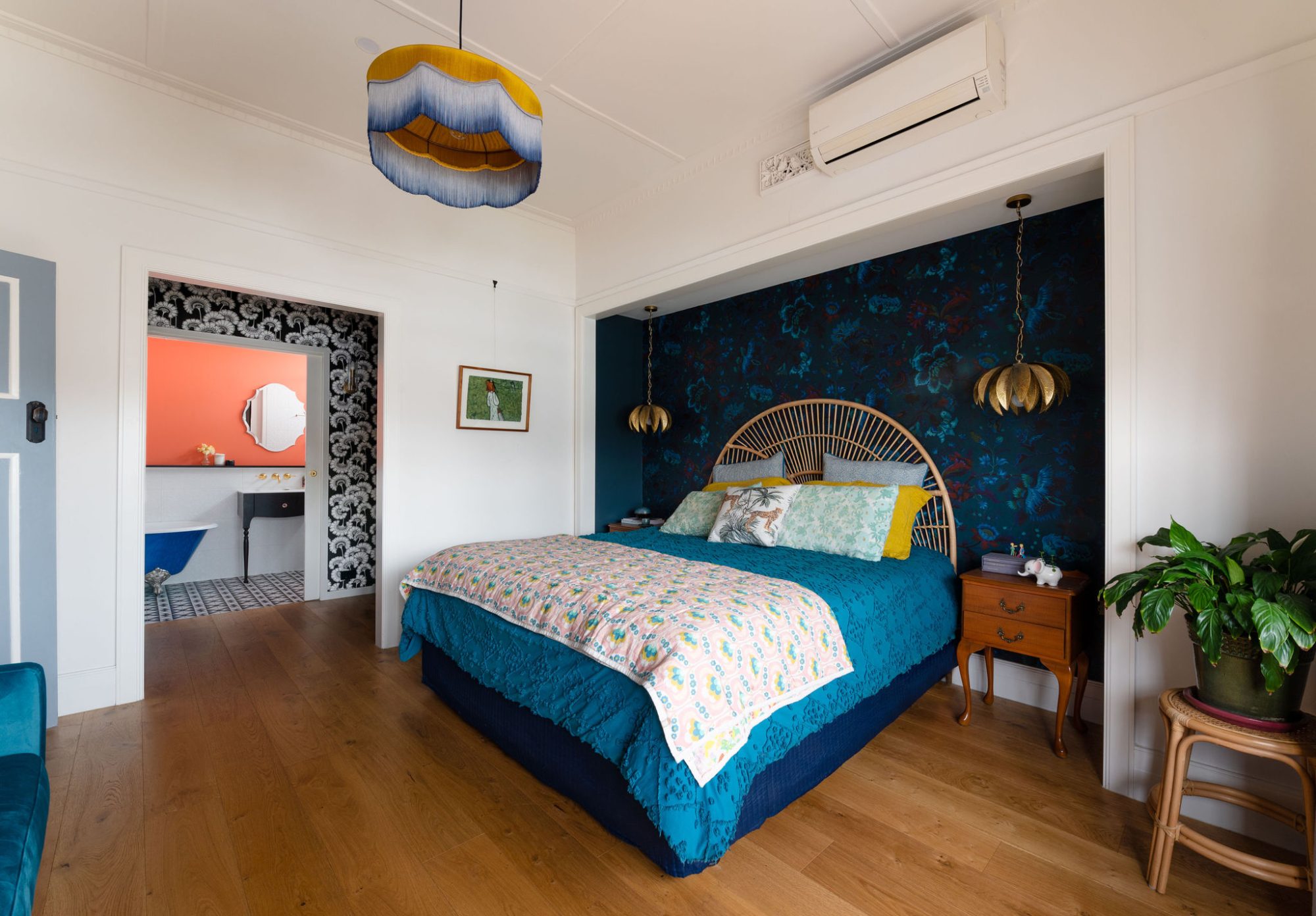
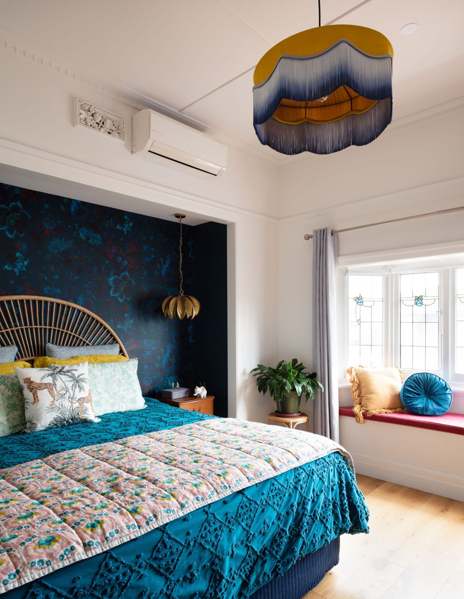
In the master bedroom we wanted to create a sophisticated but dramatic space. We added the bench seat in the bay window with a custom-made seat cushion. A mix of eclectic features are running throughout the home so combining the rattan bedhead with burnished gold pendants felt right.
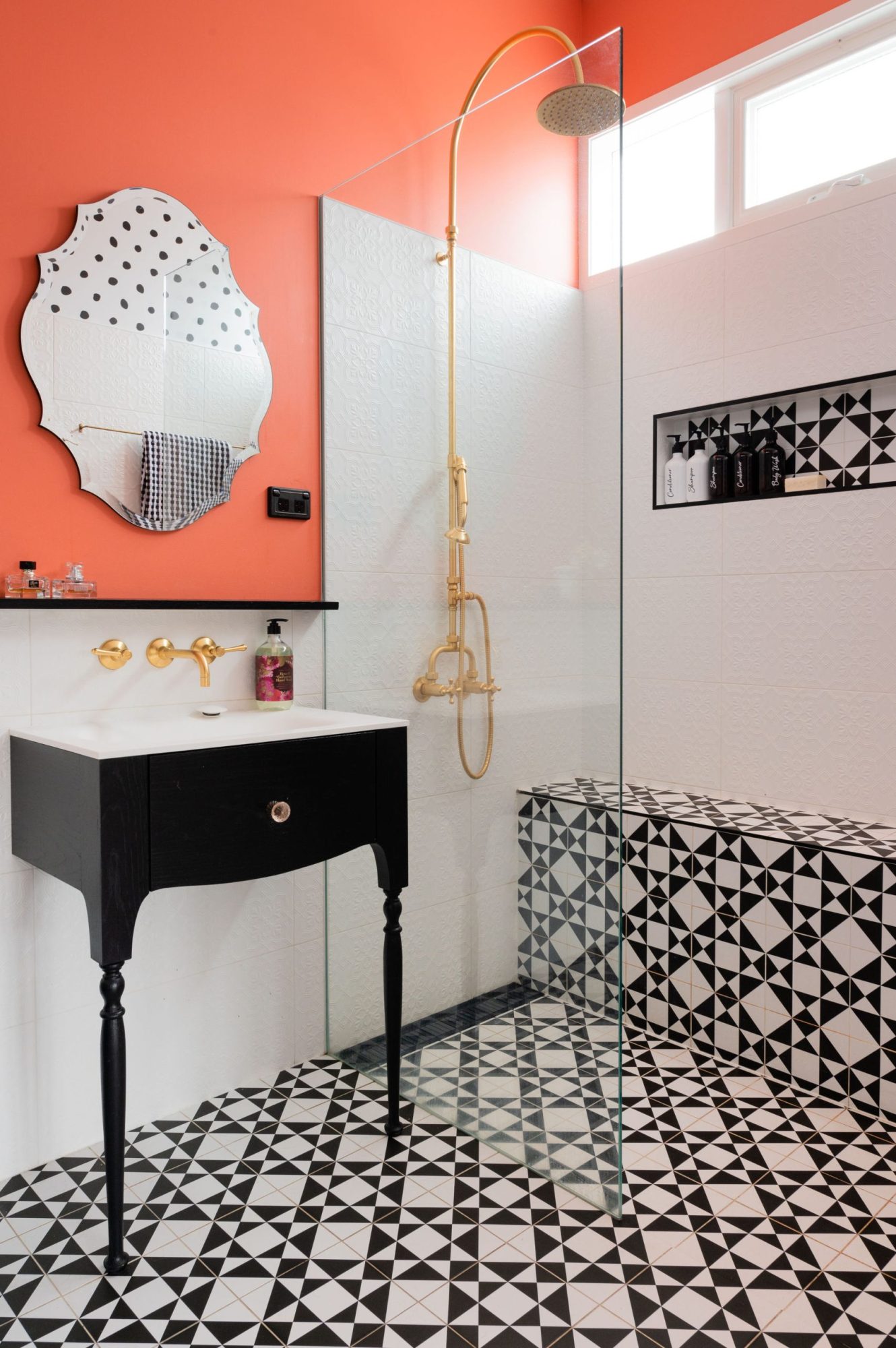
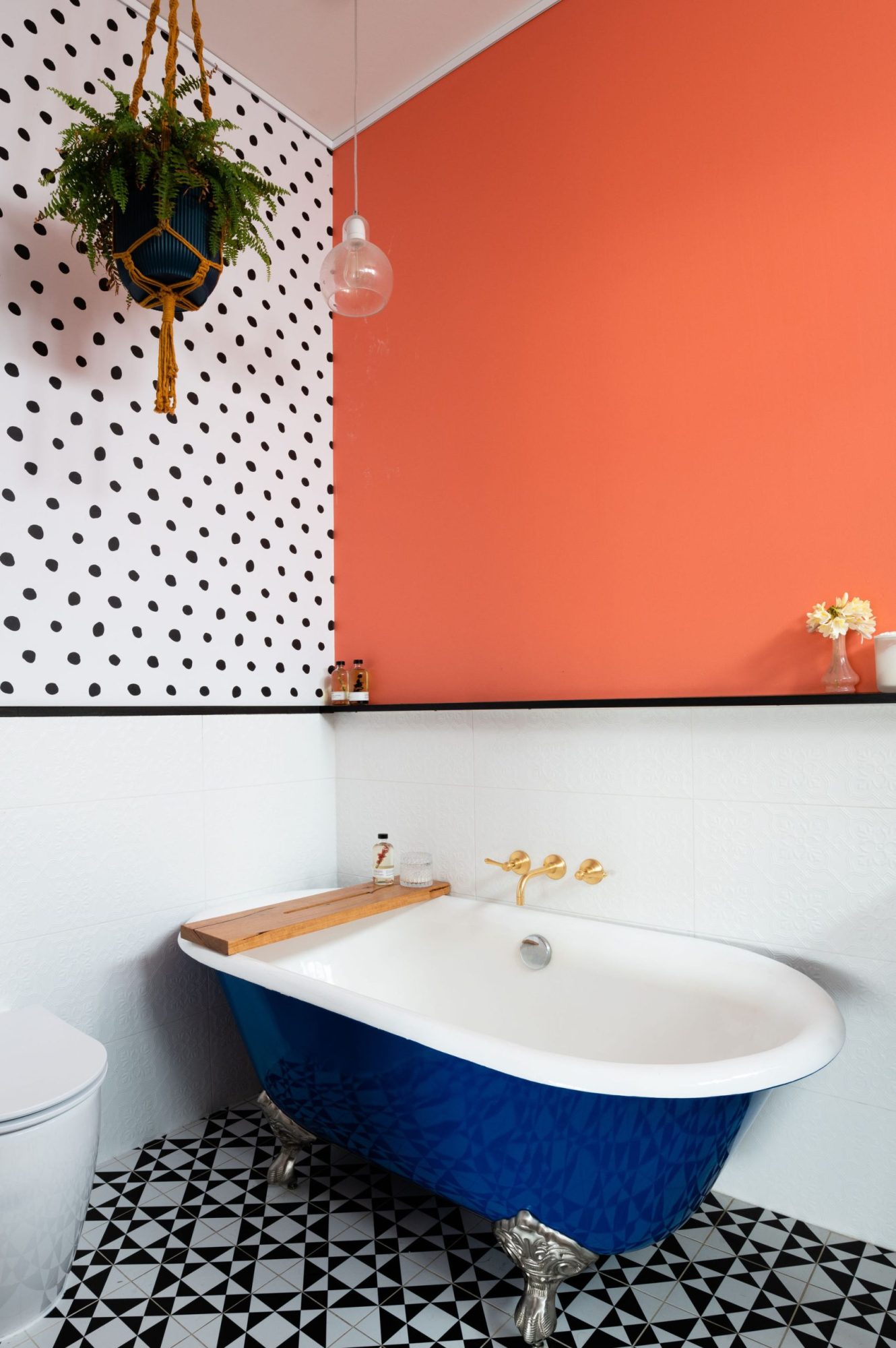
The ensuite space is small, so we had to be creative in the best way to utilise the space. It needed to feel sophisticated but not take itself too seriously. Leading into the ensuite is the black and moody walk through wardrobe adorned with a Florence Broadhurst wallpaper. This was the stepping stone to more black and white details. The delicate and elegant custom made vanity is purposely light and airy to keep the room feeling spacious. The black and white floor tiles and the faux pressed metal tiles are quite serious, so the salmon pink paint and the irregular polka dots wallpaper made the overall vibe fun.
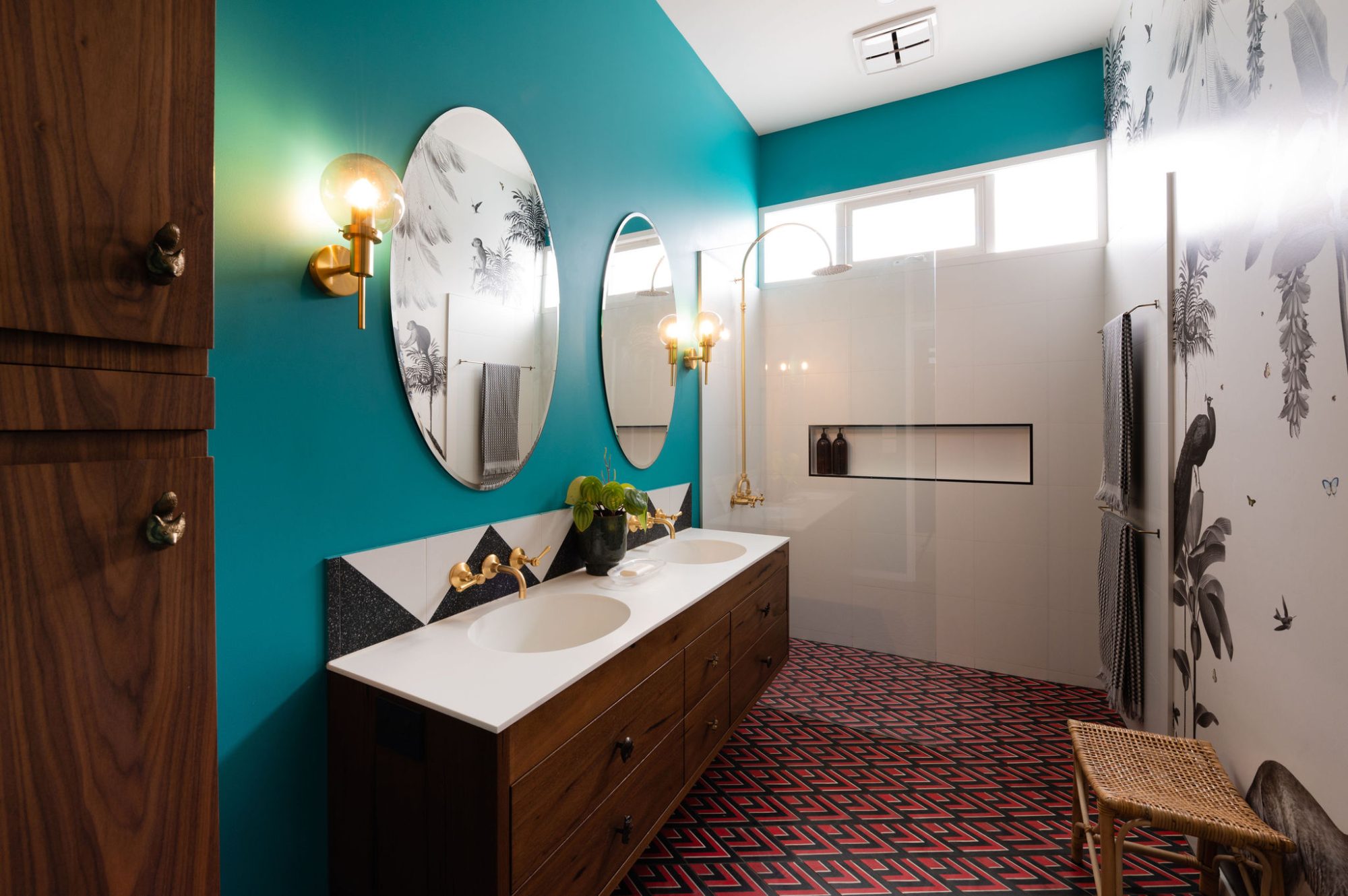
This home is first and foremost a family home, so we wanted a fun, happy bathroom that was super practical. The custom made mural although filled with animals, being black and white was the perfect balance to the teal wall. The floor tiles were custom made in Morrocco. After choosing the desired shape, we chose the red, black and white to make the floor super interesting.
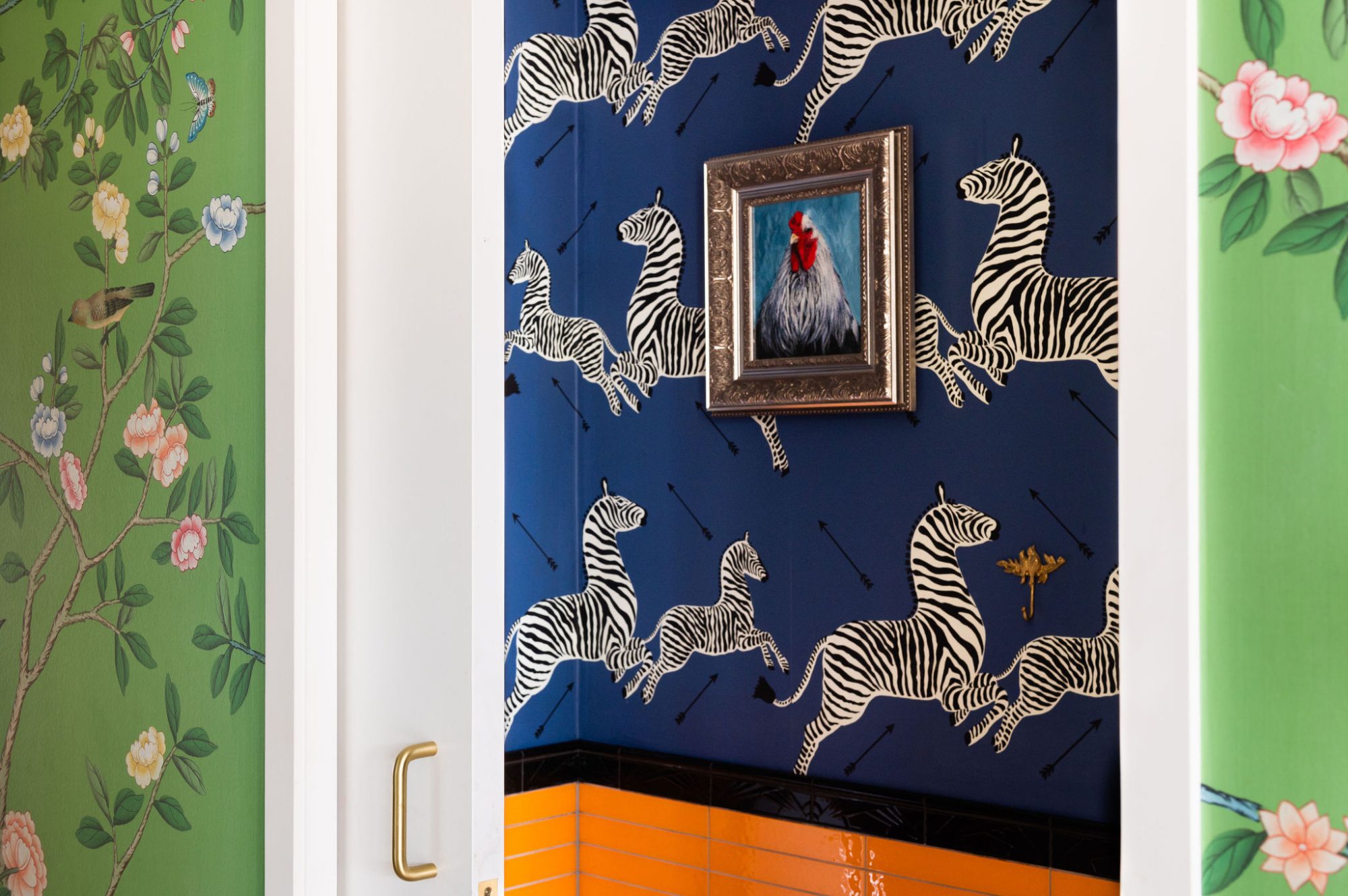
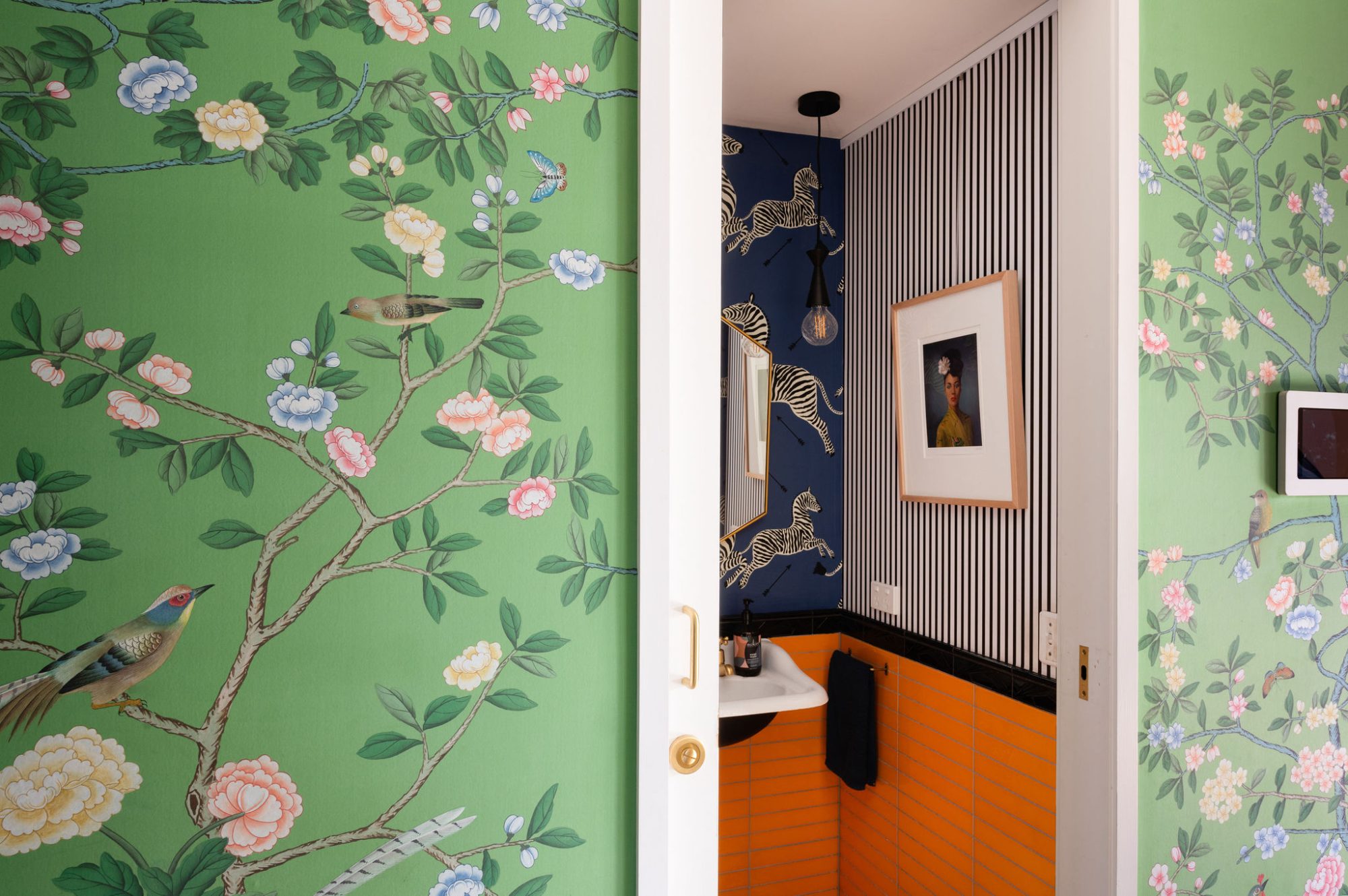
I’m all about powder rooms being as colourful, crazy and fun as possible. They’re the one room in your home that is completely removed and standalone. It just makes sense. To continue the animal theme we sourced the Zebra wallpaper from the US and added orange tiles to balance the zebras. The geometric black and white floor tiles ground the busyness of the space. The zebras cover two walls while the other two walls are covered in a custom fine black and white stripe. Despite all the patterns, this space doesn’t feel overwhelming.
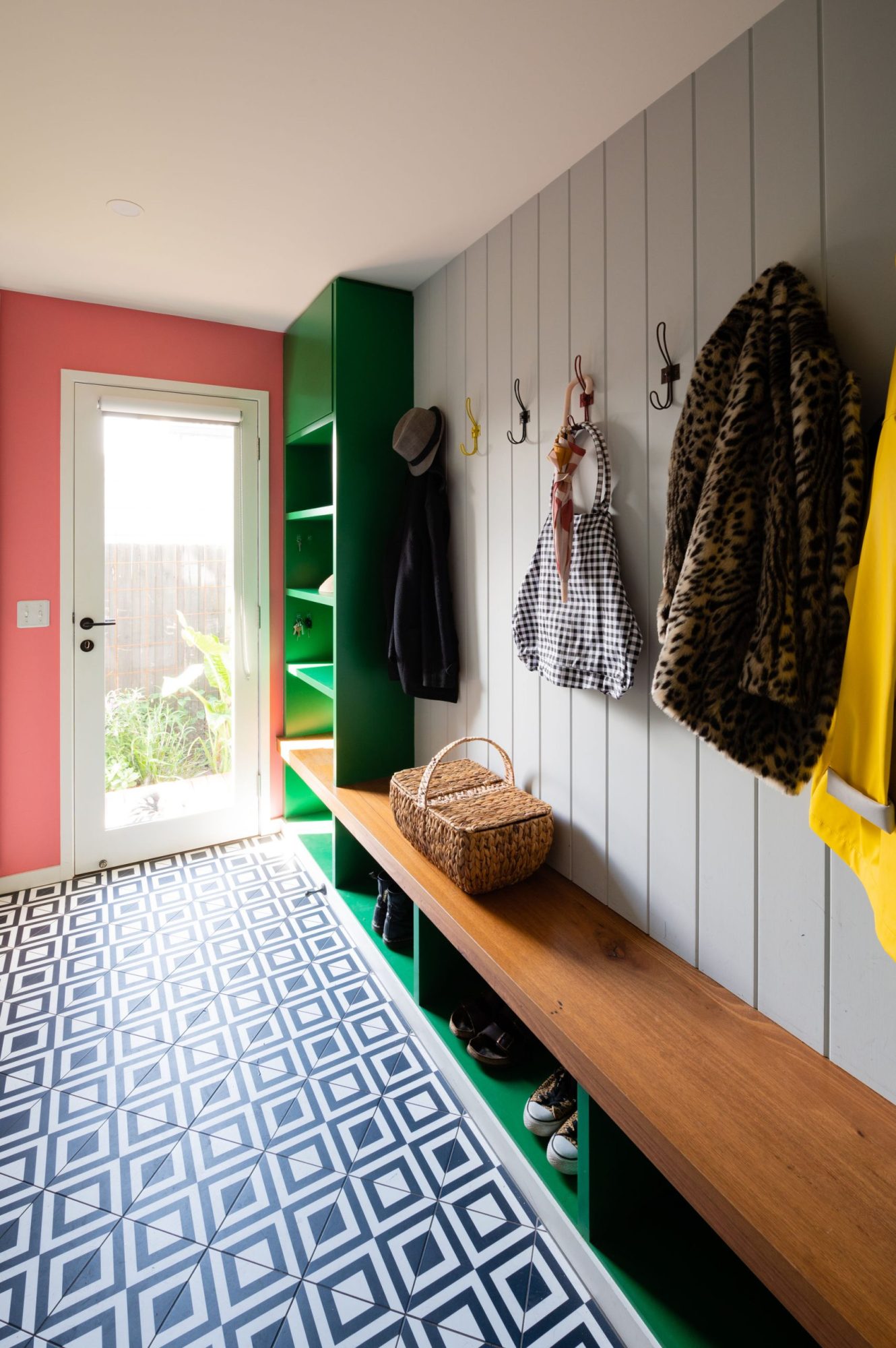
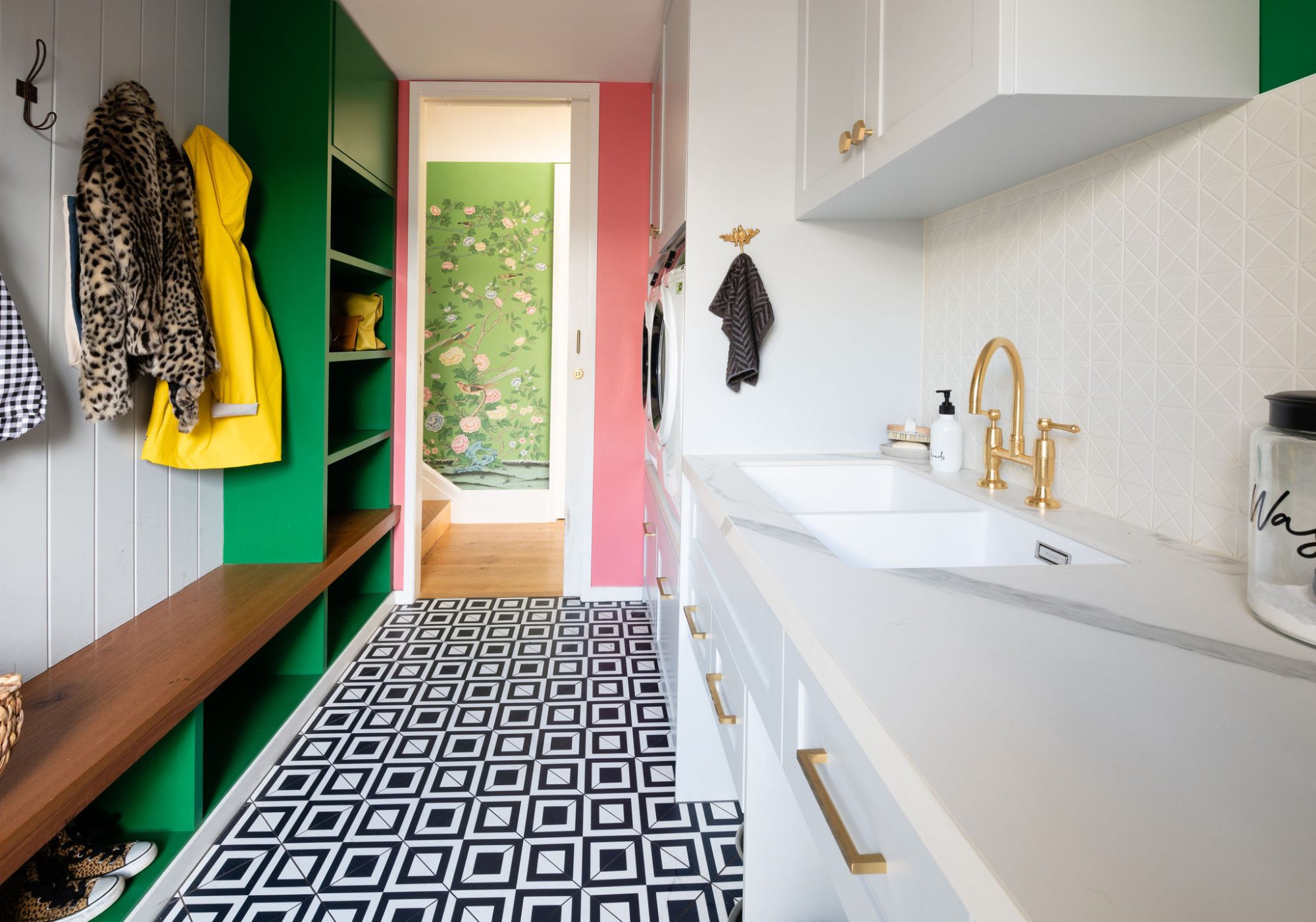
As the home is for a busy family with children, ample storage and practicality was front of mind. So the laundry is combined with mud room style storage whereby the family can enter the home from the side door and leave all their bags and jackets before moving into the rest of the home. We wanted it to be a fun, happy space. So the green and pink colour scheme is the antidote to the seriousness of the grey wall and cabinetry.
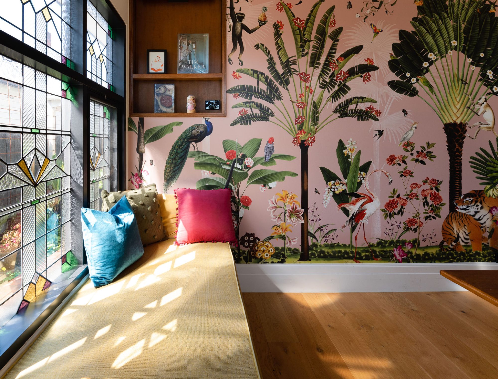
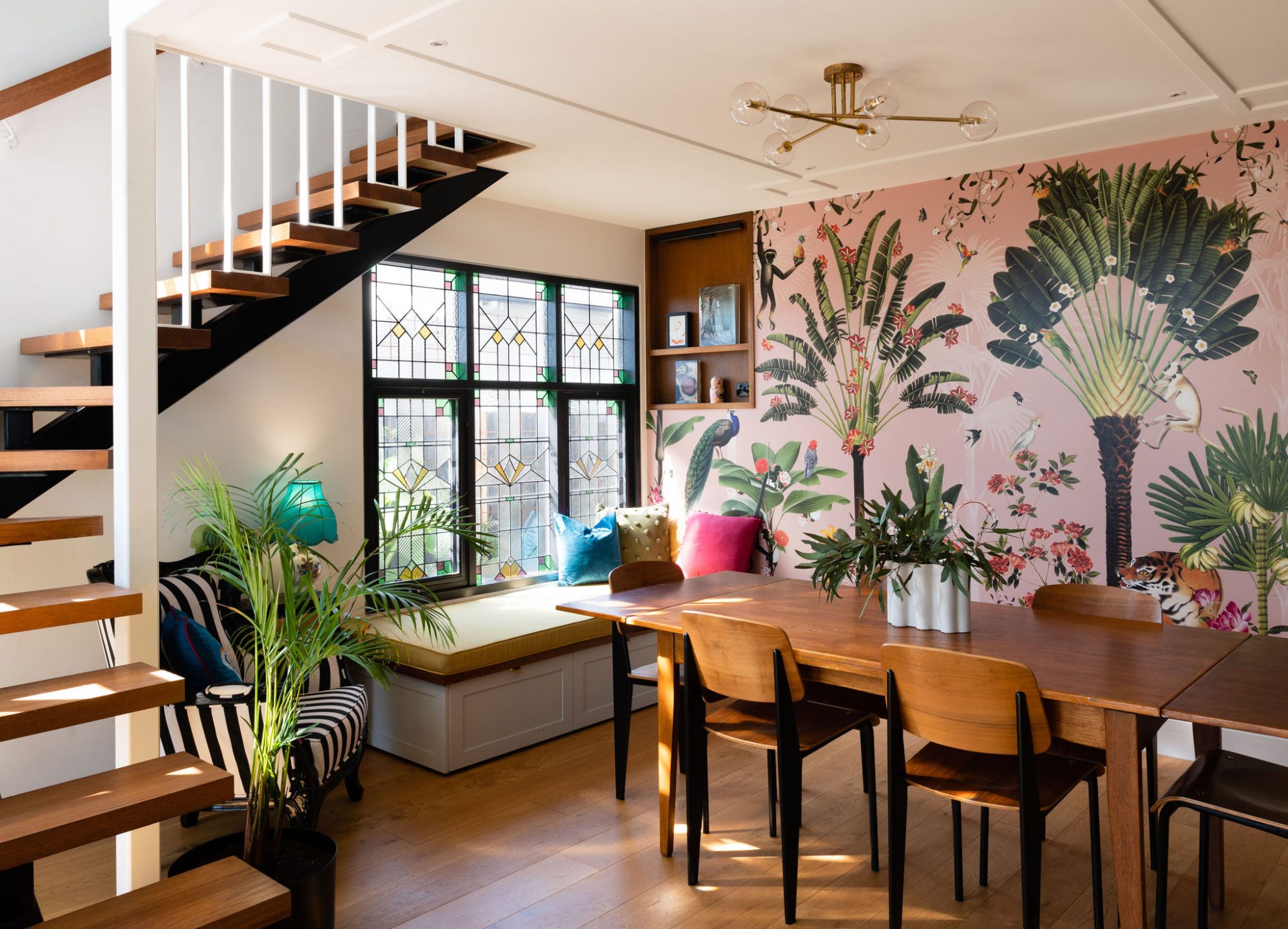
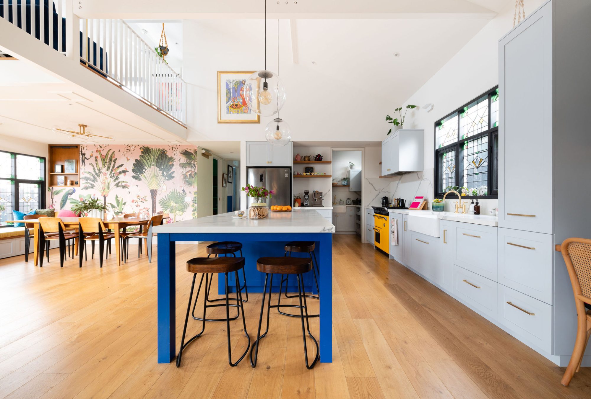
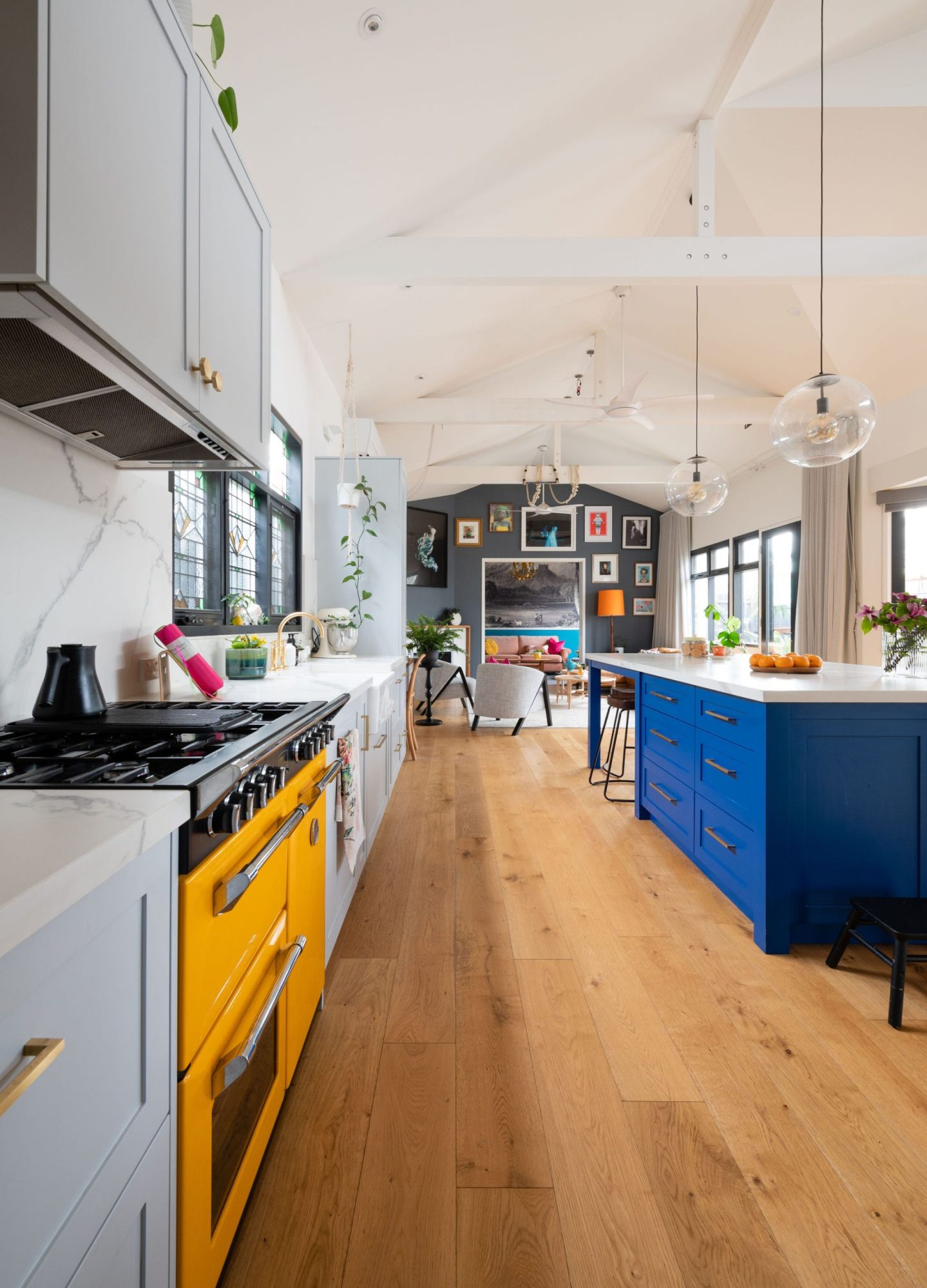
Being a period home, we wanted to add period elements to the newly constructed part of the home. The stained glass in the dining area and the kitchen are a nod to those in the original part of the home, albeit more modern. Again, we wanted whimsy and fun in this area. The kitchen itself is sophisticated and serious, so we added the animal filled pink wallpaper to lighten the mood.
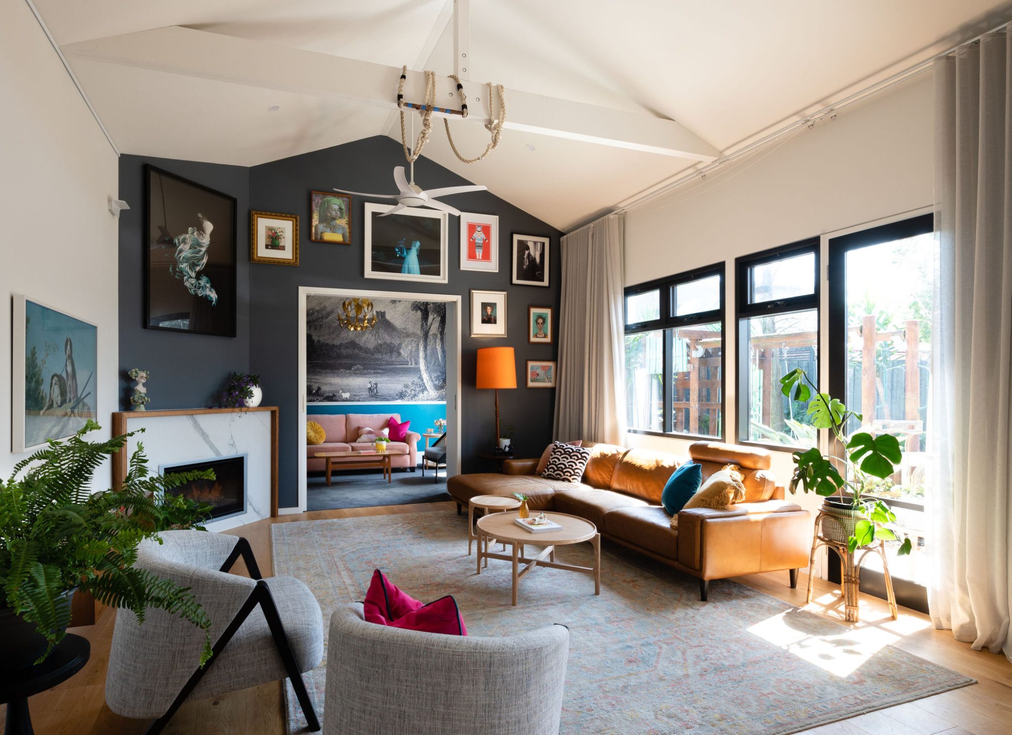
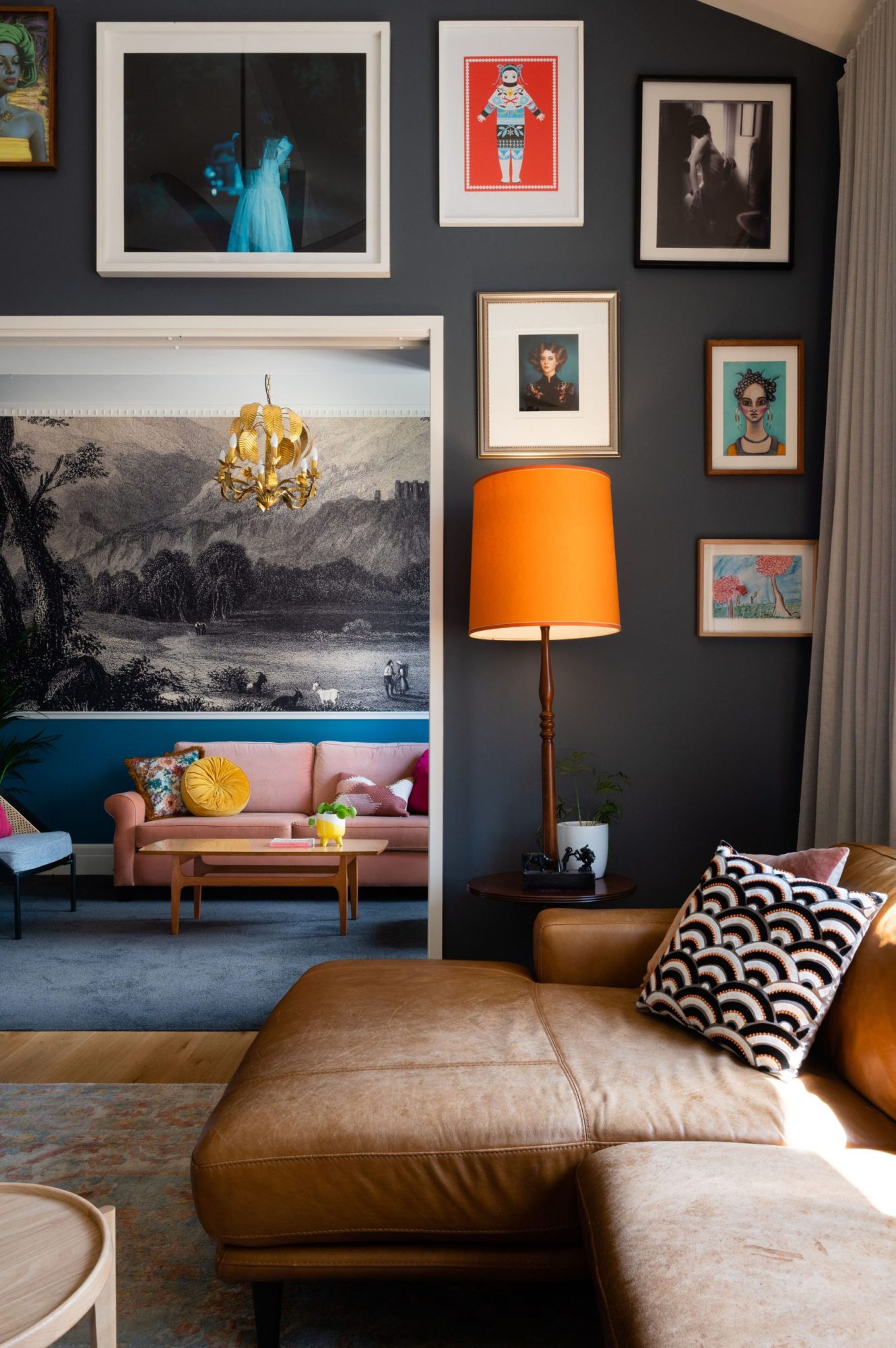
As a photographic artist, Samantha has an amazing art collection needing ample areas to display them. In the living room, the main wall lent itself to a gallery style wall. Charcoal paint colour allowed the artwork to shine.
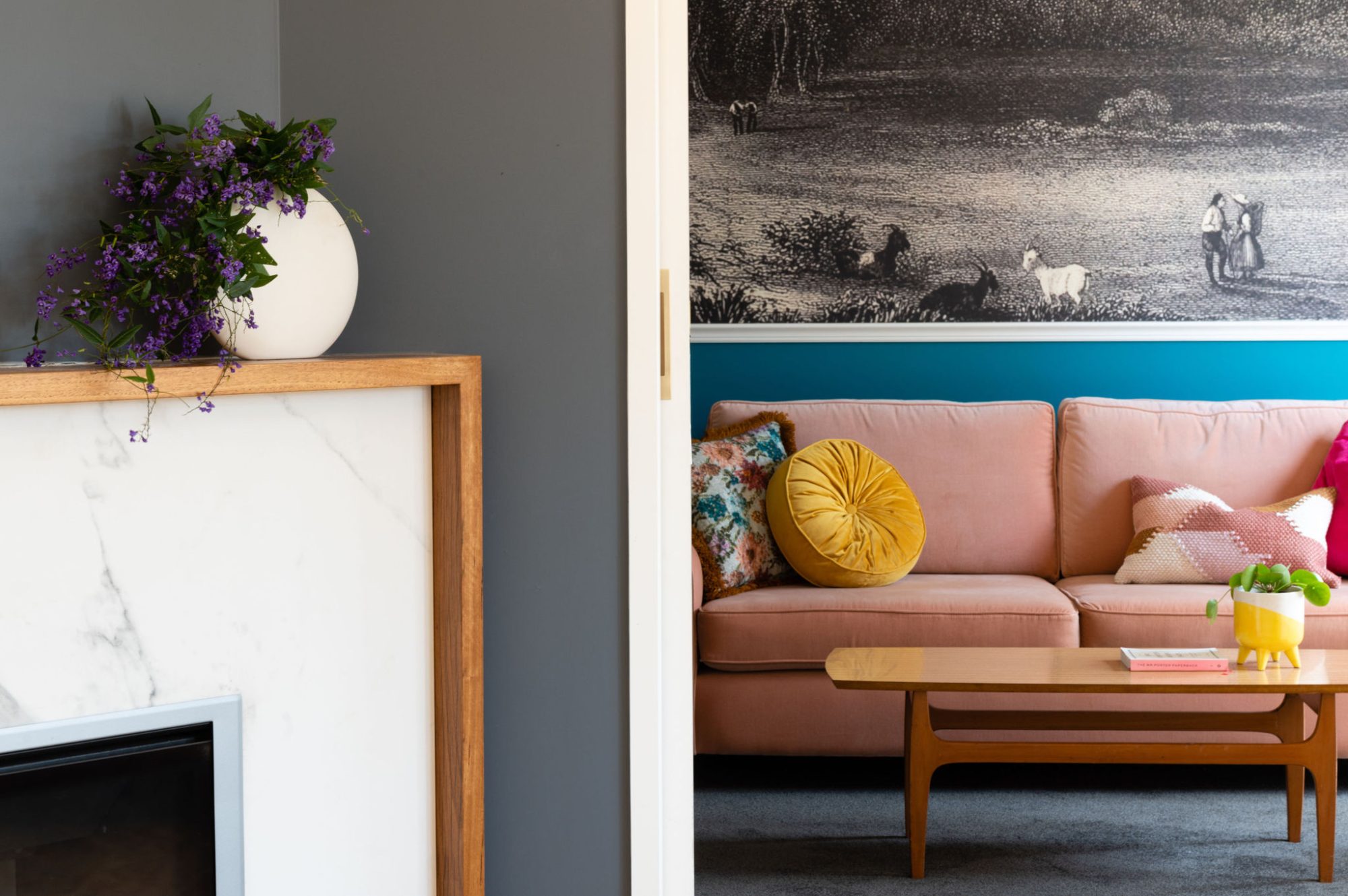
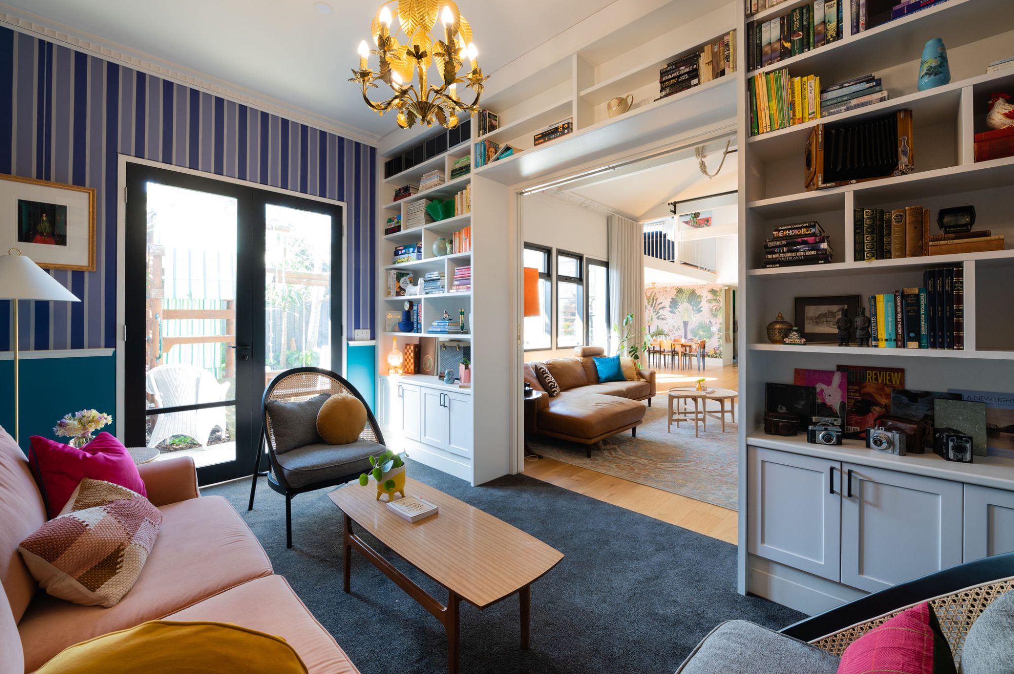
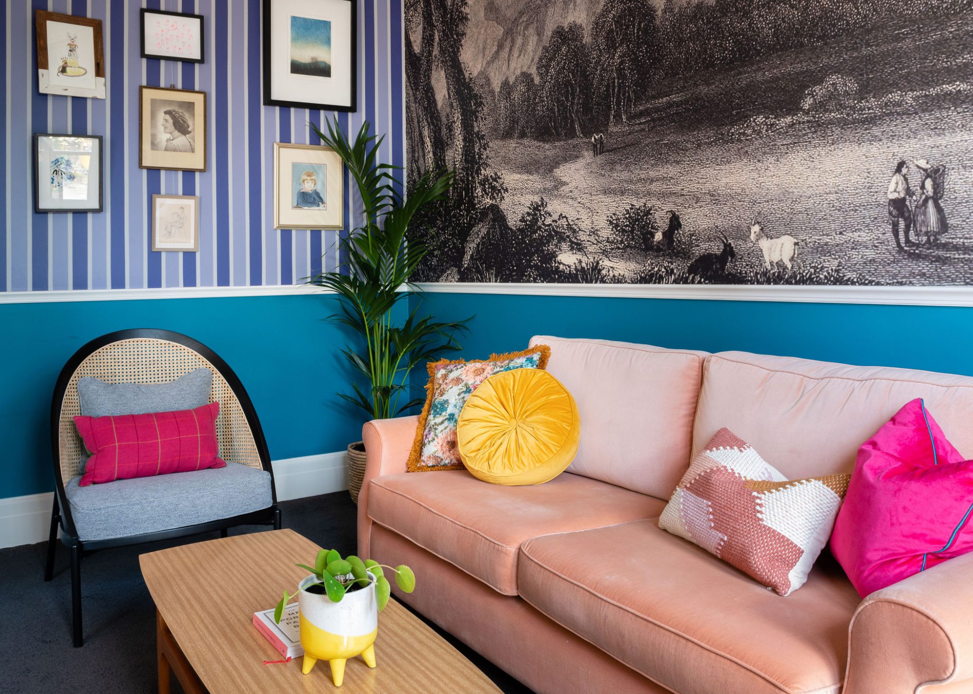
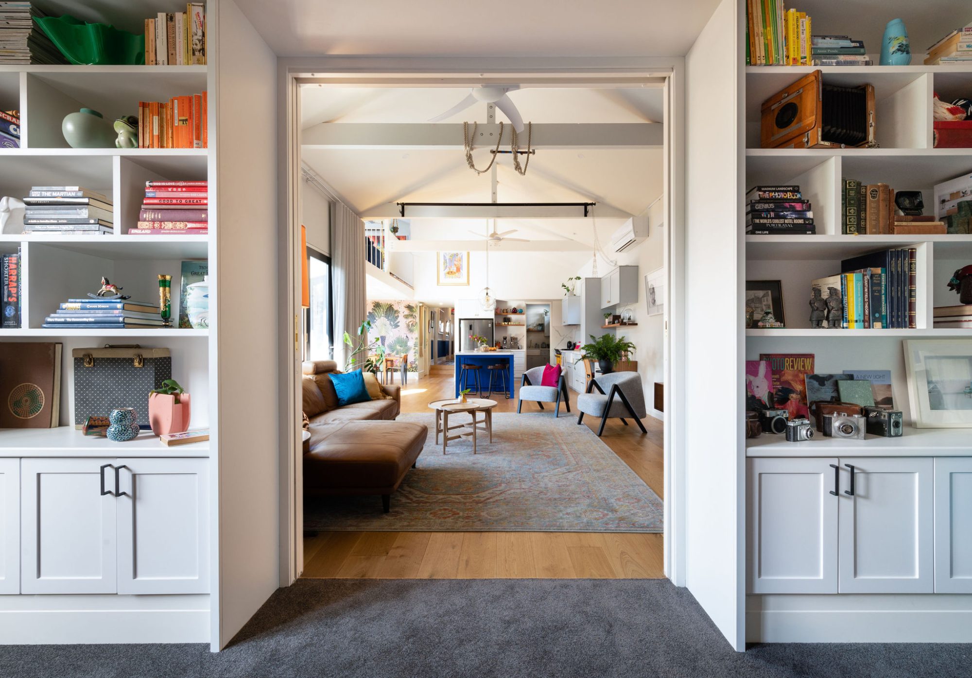
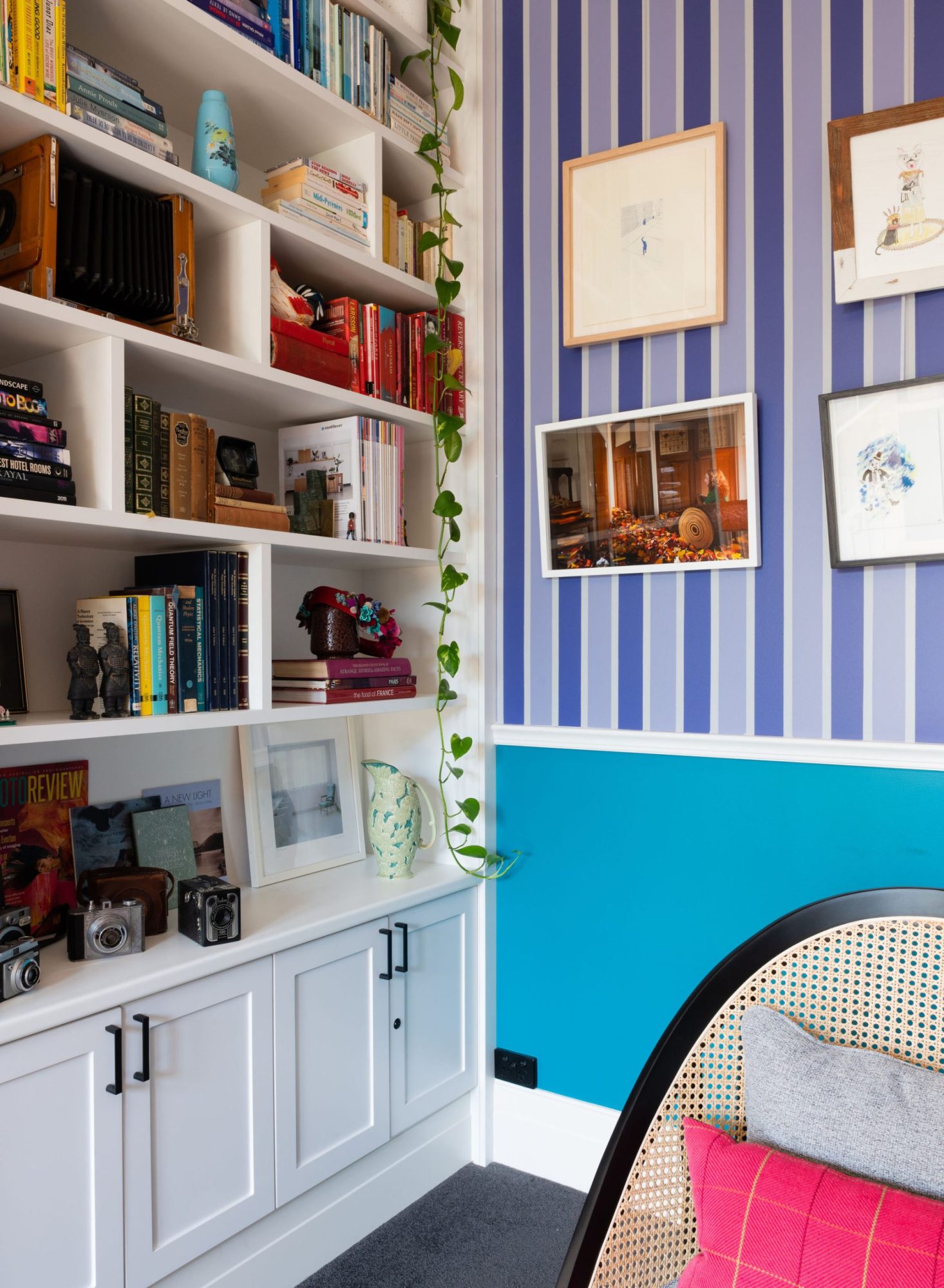
The library is my favourite room in the home. There is much to take in but the main feature of the olde world mural sets the scene. We didn’t want the mural dominating the space, so had the painter hand paint the purple stripes at either end. Opposite the mural are floor to ceiling bookshelves.
Info_


