Maximalist Interiors…the antidote to beige
Does a minimalist interior make you feel bored and uninspired? Maximalism (or a slightly toned version if you’re new to taking risks) might be the antidote for your boredom and more importantly, the antidote to beige. Think pattern, colour, interesting objects and then think some more pattern, and colour. Layered to work with one another, it’s a fine line to balance this look without looking like you’ve just filled a room for the sake of filling a room.
The maximalist interior design is based on the ‘more is better’ approach and is a multifarious mix of colours and textures. It is an escape from the mundane and everyday world. When there’s a lot of negativity happening in our lives, a fun, lively interior with lots of colours is the perfect escape. Looking for modern maximalist interior design ideas? See the examples below for those of us who love colour and pattern and need an antidote to beige.
1 – Maximalist interior…the antidote to beige.
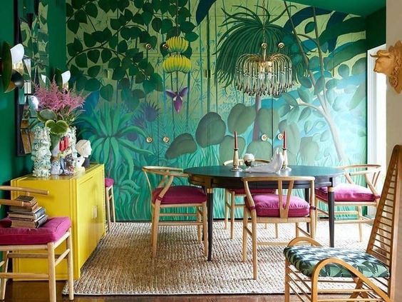
This space could have been kept much more pared back. It would still look great even if the wallpaper was the only feature and everything else was much more plain and simple. However, by simply introducing a few more pops of colour in the sideboard, pink cushions and the interesting gathering of vases and objects, the wow factor is multiplied. The addition of the rattan rug and timber slatted chairs breaks up the smooth textures and colourful tones.
2 – Maximalist interior…the antidote to beige
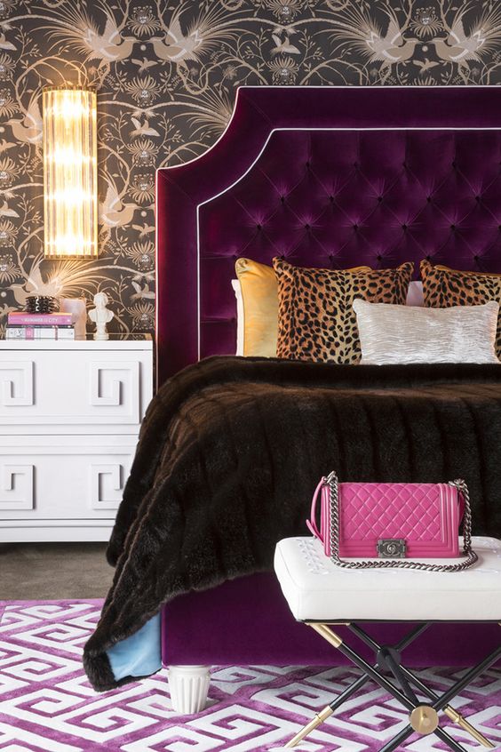
At a glance, this bedroom is basically comprised of purple and white tones, so not overly complicated. Upon closer inspection, there is a lot happening. There are 4 patterns sitting side by side. The wallpaper, the rug, the scatter cushions and the pattern on the bedside table fronts. There are also further repetitive elements happening in the buttoning of the bedhead and the lines in the bed throw. But they all work together. The primary patterns, the wallpaper and the rug are very different. The wallpaper is organic in style and darker in tone while the crisp rug is geometric. They sit well together as they don’t compete.
3 – Maximalist interior…the antidote to beige
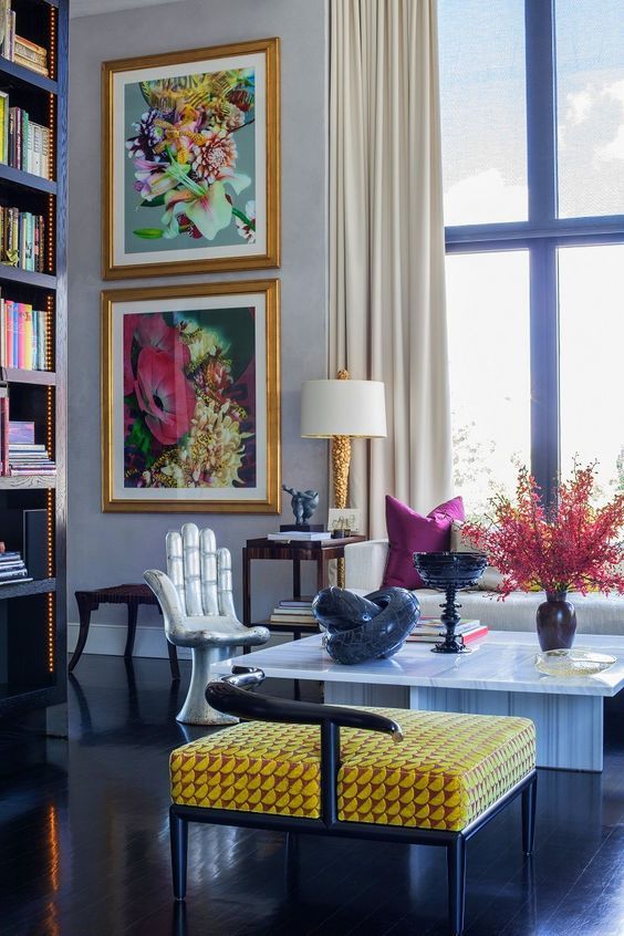
This is a much more muted maximalist space, however, there is still a lot going on. The focal points are the large colourful artworks. The designer has pulled out a few colours and introduced them in the form of the low back chair, cushion, and floral arrangement. All the furniture and decor pieces in the space are unique. There is nothing mundane or boring about any of it, each item is interesting to look at and considered.
4-Maximalist interior…the antidote to beige
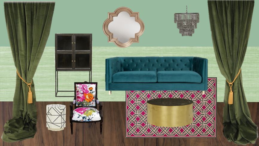
This is my take on a maximalist interior. There are lots of textures and colours happening. Velvet cushions and sofa, gold metals in the mirror and coffee table. Marble and stone on the coffee and side table. Ceramic beads in the chandelier sitting against textured wallpaper. In terms of pattern, there is the geometric rug, the armchair’s pattern is quite organic and stylised while the side table’s pattern is random and irregular – all completely different. Colour wise, a combination of brighter pink, orange and teal sit comfortably with the muted green/blue tones of the wall. The green curtains throw a curve ball but still work as they are quite muted.
There are various ways in which you can incorporate the fun and vibrancy of maximalism into your home. With the idea of excess taking a centre stage, a maximalist interior offers the perfect escape from the grim.
The key elements to creating a successful maximalist interiors are:
Patterns – try to combine a few different types of different scales and styles.
Colour- don’t hold back but try to keep it balanced. For example, the pink in the patterned armchair and rug balance the solidness of the teal sofa. If all items were plain the space would be boring.
Think layers and textures – lots of velvets, silks, textured rugs, marble finishes, rich timber tones.
Metallic – adding metallic finishes adds richness, don’t be afraid to mix metals either. Small amounts of chrome with brushed brass or gold can add to the eclectic-ness of the space.
Walls – a textured wallpaper can be far more interesting than plain painted walls. It needn’t be the whole room, up to a picture rail or dado just to mix things up.


